Fix up, look sharp
 Spurs News 24/7
Hype. It helps to build up anticipation to the point where once it turns rumour to reality it either dissolves in abject disappointment or becomes a tidal wave of biblical force, washing everything away in its path. It's all a bit unnecessary. It is after all, just another kit, which replaces the one it follows by a single calender year.
Under Armour don't even need to crack the whip with the marketing department, thanks to that very same anticipation birthing continuous unofficial coverage throughout the barren wastelands of the summer months. There are almost as many mock-up shirts and kits as there are ITK accounts and transfer stories.
Today, UA launched the 2014 versions in Shoreditch and even in the hours before the party we found ourselves scratching our heads at a live mocked-up page (which was then pulled) including an image that had done the rounds already a week earlier. Mismatched colours, untidy photoshops. Dempsey looks like he's sporting a PVC wet-look. Less said about the 'striker' label accompanying his name, the better.
Do you see what happens Mr Levy when you don't buy us a striker? Our time is consumed, obsessing about what white and blue colours our white and blue fabrics will be for the new season. Oh look, they're whiteish and blueish, again.
via @likeavillasboas
Personally, I don't obsess. Okay, I do a little, but I'm not a consumer of shirts/kits so all that interests me is that they are white and blue and stylish with it. Hopefully minimal in design with no unnecessary patterns or colours. I prefer the old skool look, but know that's hardly going to happen in-order to avoid the 'it's just too plain' backlash. Designers need to look like they've done something. I guess the irony is, they don't really need to do much if they want to get it right. Also, sadly, modern football shirts are more or less dominated by the sponsor logo as it's quite unavoidable once splattered across the chest.
I really should have been there to protest by taking photos with an iPad (couldn't make it having been invited but had someone go in my place). Would have loved to have seen Evil Chirpy gate-crash, smashed out of his face, wearing a Holsten shirt and breaking mannequins over the head of Disney Chirpy. Or Levy sporting the home shirt with 'Striker Kitty' on the back with the number 0 below it. Ah, the realm of fantasy, it never lets me down.
Alas, instead, I was sat at home reading my Twitter timeline whilst everyone sat in anticipation (there's that word again) for the reveal whilst others mocked the parody that football has become.
Is a kit launch really necessary? Probably not. Unless by 'launch' you're referring to the kits appearing on the official website. But this is the generation where everything has a song and dance routine attached to it. And we do love a sing and dance down the Lane.
As for the actual new kits themselves? Modelled by Dawson, Friedel, Defoe and GARETH BALE, they turned out to be the exact ones as shown in that mocked-up page. Just far better looking 'in real life'.
I still don't think the colour of the HP logo quite fits in with the darker blue. The rest of the shirt? I like. Again, you can't or rather you shouldn't go wrong with a Spurs shirt design. It's white. With some blue. Make it look stylish. That's all you need to do. And that's more or less been done.
So thank you UA for keeping it Spursy. Nowt they can do with the HP bit if HP were not willing to alter their own colours. If it matched up to the navy elsewhere on the kit - happy days. Much like Mansion/Thomson didn't remove red from their logos, looks like HP won't budge from their light blue. Having said that...it's far more likely that nobody actually asked for it to match up with the rest of the kit.
Let's just be happy that there is no RED!
No third kit displayed. Also, from the looks of it, we've stuck with the navy socks to go along with the shorts (rather than the traditional white navy white combo).
Also, HP announced as our principal partner/sponsor for the 2014 season. That's just the one season.
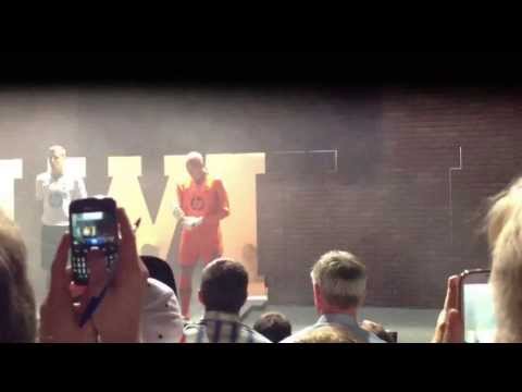
@SibsTHFC was representing DML at the launch. Check out his timeline for more. His Twitter pics are included in the slideshow below along with a couple of short videos. Try not to laugh at the players hulking it through the wall.
More from Sibs in the next day or so with some exclusive fancy photos.


